

I have once again updated the website's visuals!
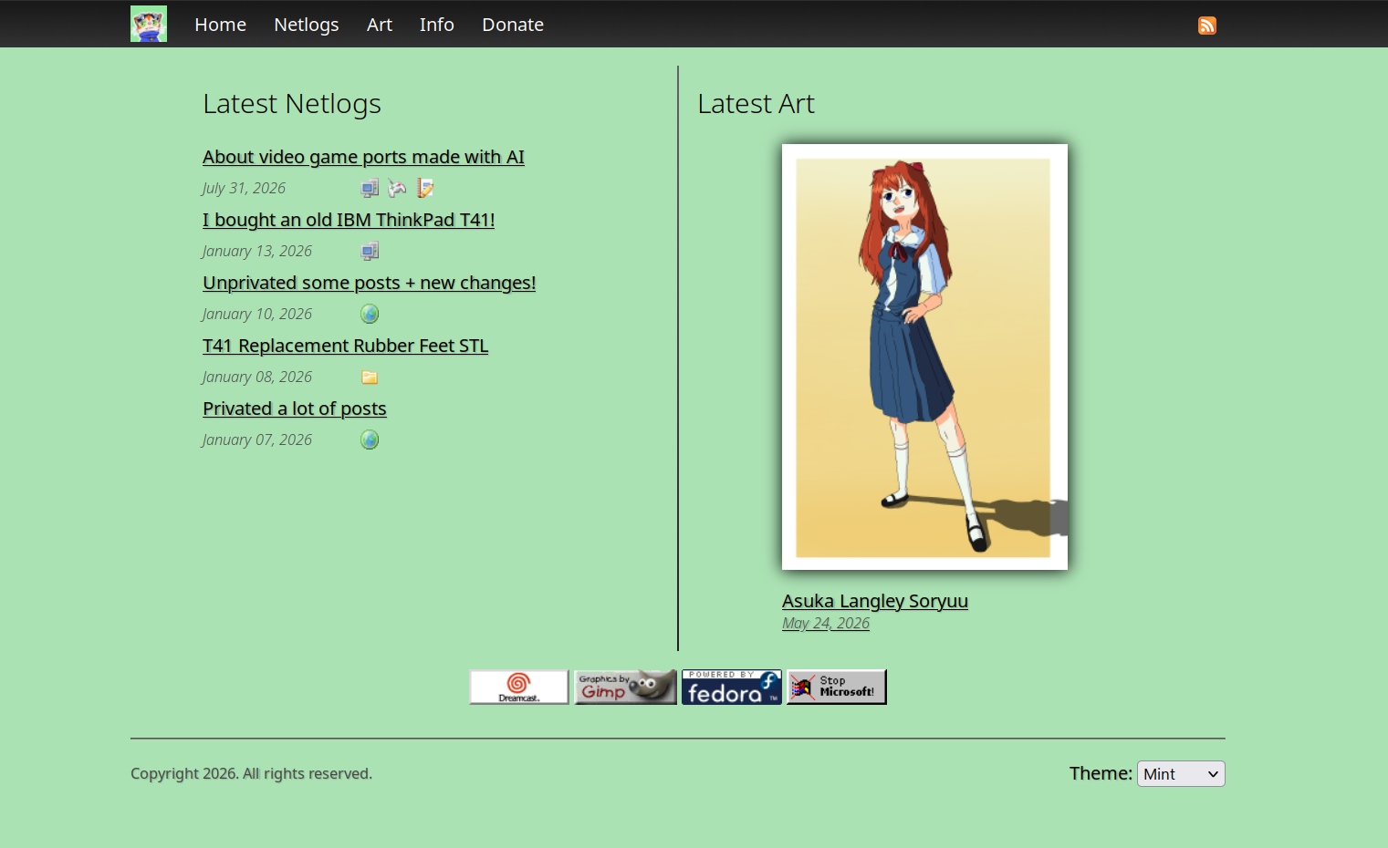
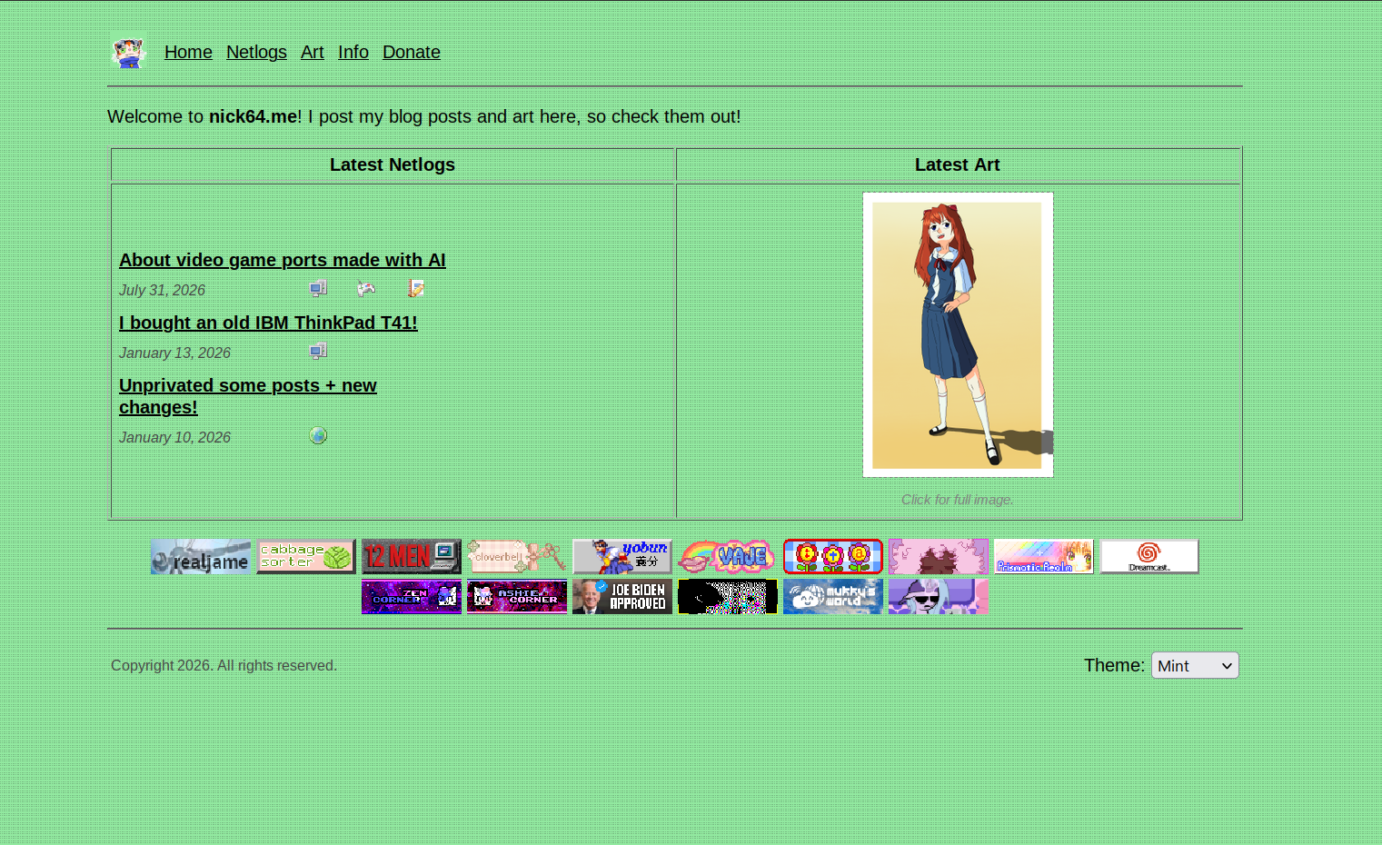
I wasn't completely against how I had it before (I'll come back to this later), but I wanted to have my website be a little bit more presentable and flexible, so I decided to give it a fresh new coat of paint.
|
| Click for full image. |
|
|
|
| Click for full image. |
|
|
Structurally, not much has changed. I think besides maybe some small stuff in the future, I think this layout of the website is pretty good. It looks nice on desktop, but also works well on mobile.
Some people might not like the idea of mobile-first design, but I think that as the world uses the internet on their phones more and more, I think that finding a balance between a functioning mobile website that also looks good on PC, let alone looking good, is important too. I think there is a place for websites designed around PC use specifically, and some of those websites are really awesome! But I also think that the hate for mobile support from some people is overblown. Nonetheless, my site does have a good mobile layout, so check that out if you aren't already :)
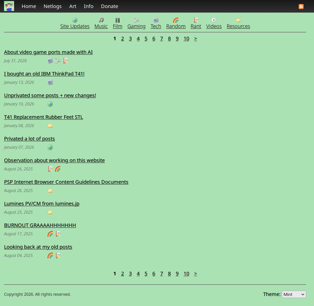
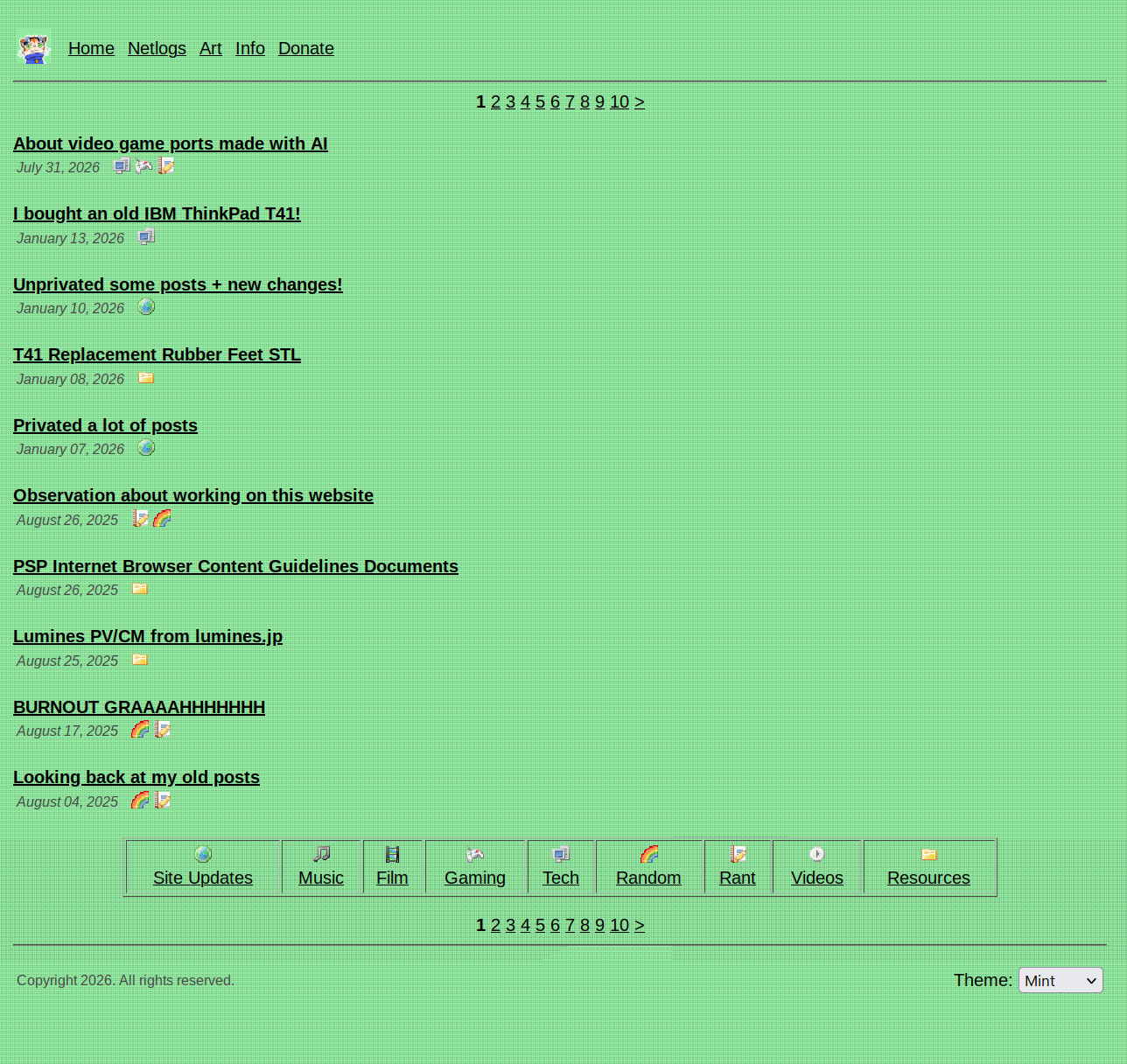
There's not much else to show really, but here's some more screenshots of the old and new websites:
|
| Click for full image. |
|
|
|
| Click for full image. |
|
|
|
| Click for full image. |
|
|
|
| Click for full image. |
|
|
|
| Click for full image. |
|
|
|
| Click for full image. |
|
|
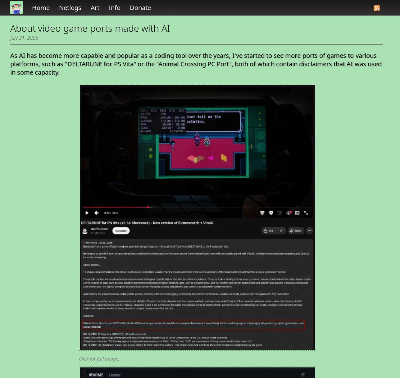
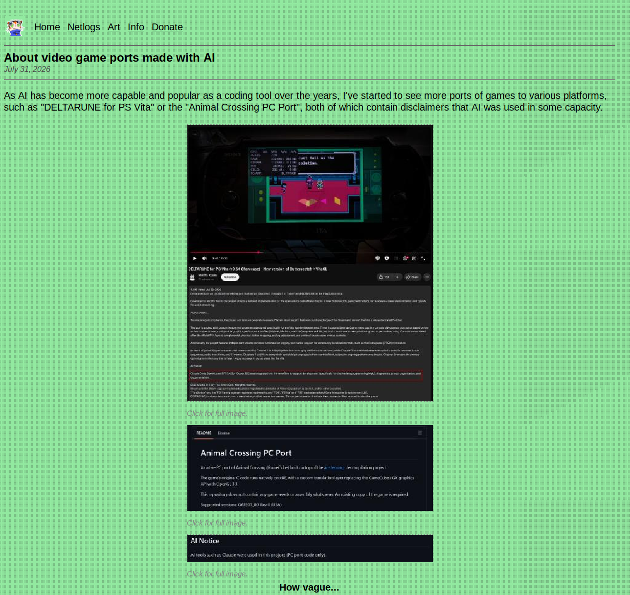
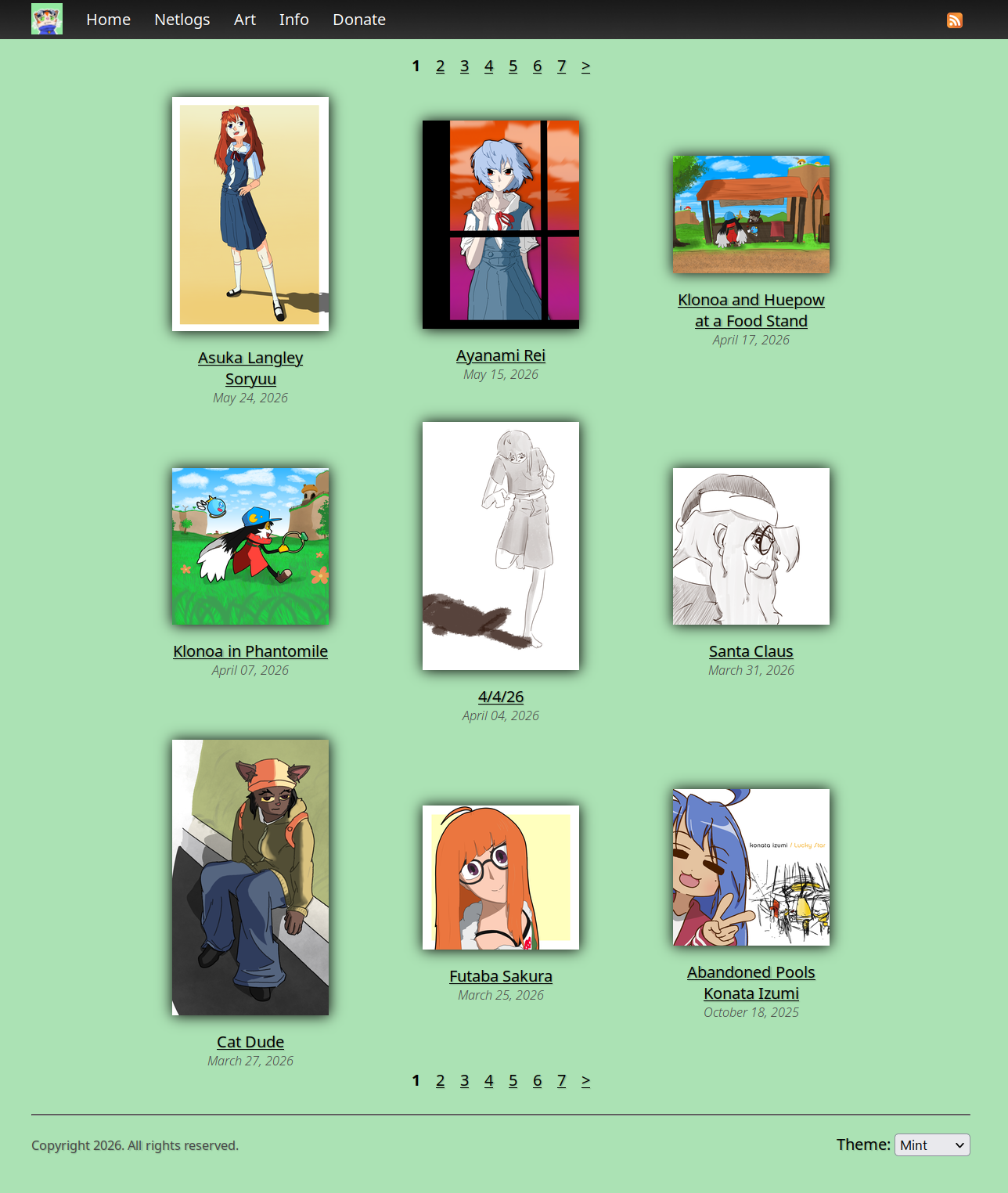
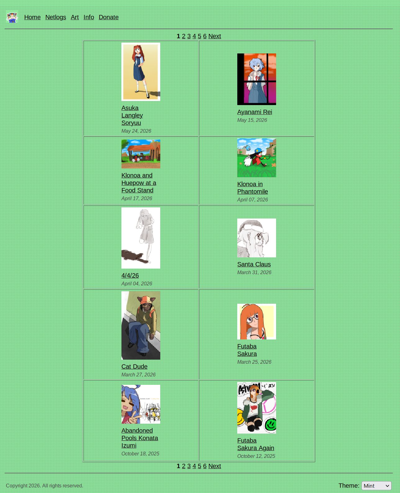
I think most of the changes are self-explanatory from the images, so I won't go too in-depth. As much as I don't like Microsoft, I do kind of like their late 2000s to early 2010s design cues, so I adopted some minor skeuomorphism, the square elements, and I'm using Noto Sans as an alternative to Segue UI on my website for text elements. I'm pretty proud of how it looks.
I mentioned earlier that I would bring up the old website again. While I want this design to be the new standard, I do want to explore using the previous theme again, perhaps launching a subdomain like "legacy.nick64.me" or something for older computers to be able to render my website. This is an approach I have taken before, and I think it would be cool to do it again.
Sadly, I don't have enough time to implement it at the moment since I will be on a trip with no laptop accessible for a few weeks, but I will try to be thinking about how to approach this.
With that being said though, hope whoever checks this site likes the new layout!