Yesterday, shortly after the first conference of the Summer Game Fest ended, where I didn't care, nor was expecting much to happen, the trailers for Persona 3 Reload and Persona 5 Tactica leaked online through ATLUS' Instagram. I couldn't really care less for P5 Tactica, but I was hyped for Persona 3 Reload. And after watching the trailer, I have some thoughts on what's been shown so far.
The 2D Graphics
In terms of 2D graphics and UI, I mostly like the improvements and new things they did with it. They refreshed the portrait art for all characters to line up with the modern Persona style, which is pretty neat and looks great.
persona 3 remake portrait comparison pic.twitter.com/RHYeNkgiPC
— akechi goro time (レオ) (@akechigoroboy) June 9, 2023
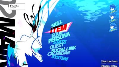
The UI is alright. The pause menu in particular looks awesome with the Persona 5-esque layout and styling, along with the water theme of it all, although how much it fits into Persona 3 overall is debatable. Then again, I am not one to say that, since I only have about 20 hours on Persona 3. I think it looks good overall, and I think it fits alright enough.

|
| Click for full image. |
|
|
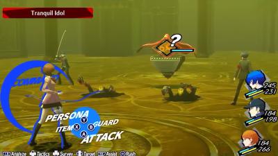
The battle menu on the other hand, I don't know... I think that it leans too much into Persona 5's style. And why did they get rid of the revolver menu? The menu overall looks more boring than it should've been. I hope that this gets changed before release, but knowing ATLUS, I sort of doubt it.

|
| Click for full image. |
|
|
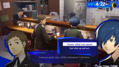
The dialogue menu is something I am kind of indifferent about. I don't think it's an upgrade or downgrade from the original, it's distinct in its own way, but still preserves the vibe of the original, if that makes sense. It's fine.

|
| Click for full image. |
|
|
Another thing with the UI that I'm not sure I like, this may sound weird... it's too blue? They seem like they're trying to do what Persona 5 did where they had the elements contrast with the game's central color by having these drop shadows on stuff like the portaits, or in the Battle UI, and I don't really like it. I wish that they kept the redesign more in-line with Persona 3's original design. I'm fine with modernizing the game's look, but I think they're trying too hard to make it like Persona 5.
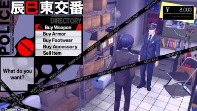
But hey, at least the shop menu looks fine. It's pretty in-line to the original game, and I think this is a good example of how the UI should've been designed: given modern touch-ups and edits, but still maintaining the core aspects of the original design.

|
| Click for full image. |
|
|
The 3D Graphics
I don't know if I really like them too much, honestly. It might grow on me, but I think it looks weird.
About 22 seconds in the trailer, the gameplay has this motion blur look, and everytime I see it, it reminds me of those videos that are like "I RECREATED MARIO IN UNREAL ENGINE!!!".
Things like motion blur don't fit in this sort of game. But it's not even that, it's the fact that the game is MADE IN UNREAL ENGINE. I don't mind that, you can make some really cool looking stuff in UE, but the game just has that Unreal look to it, and I don't like that much. And using Unreal is kind of weird to me... They have the engine they developed in-house for Persona 5... why not just use that?
With all the Persona 5 games, the new ones have grown stale graphically, and it's because the games don't use the in-house engine from the original game, they're all made in Unreal, or something else, which gives the style of those games a somewhat... boring look? It doesn't look as unique as Persona 5, and this game seems to have that same issue. I think using Unreal is fine, but I think the 3D graphics need some more work to set them apart from that Unreal look. Some clips look pretty alright though, like I don't think the game looks horrible, but... yeah.
In the end...
As much as I have complaints about this game, I am overall really excited for this, and these complaints are more minor than anything, although I think these are things ATLUS should consider, since I'm not the only one with these complaints. But worse case scenario, modders will probably fix things up. Looking forward to this coming out in early 2024.
