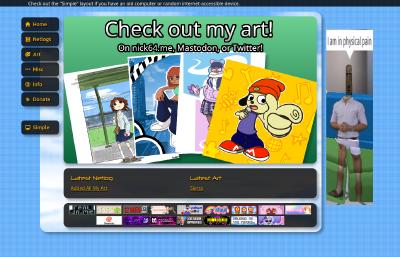
It's been a while since I've really done much with the website, but today's the day that's gonna change... and then not update it for another year.
|
| Click for full image. |
|
|
Some things might pop out immediately so I want to get them out of the way, starting with...
Ads
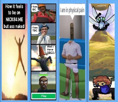
No, they're not real ads, I haven't sold out (yet). This banner on the side shows a random assortment of fake ads created for the site. I thought it would give the site some more character to have a banner there, and make it more reminiscient of other old sites, like how Roblox let users make ads. I think it's a cool touch, and I'm grateful to my friends who helped create most of the ads so far. Each ad made by them will have their webpage links on them, so check them out!
|
| Click for full image. |
|
|
And hey y'know, if you want to make an ad or something, feel free to send it to me in my email or my social media!
The marquee
I was looking at the old Roblox marquee they would have on top of games and thought, "Huh, that looks cool." So I put it on my own site! It just displays a random quote or text every reload, so it'll give a small bit of fun whenever going on a new page.

|
| Click for full image. |
|
|
Misc
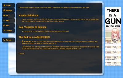
The "Archive" tab has now been renamed to "Misc", and on top of that, a couple of new sections were added.
|
| Click for full image. |
|
|
Cool Websites to Explore
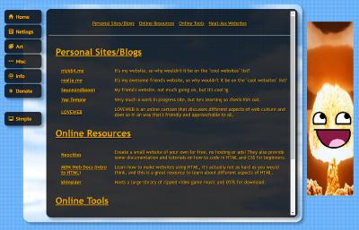
This was a section I wanted to make for a while, it's less of a practical thing and more just a fun thing for myself, listing all the websites on the internet that I like for some reason or another, but I also hope people can use it as a resource for finding something new, or maybe inspiriation, or something.
|
| Click for full image. |
|
|
simple.nick64.me
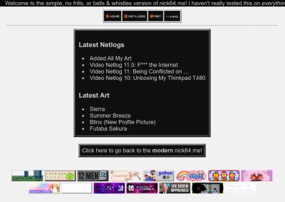
I had talked for a while about making a "simple" layout for the site, one that would work with many more devices than the current one, and I think it's at the point that I'm ready to present it... I actually had it up for a week or two now, I just never announced it lol.
|
| Click for full image. |
|
|
This is the homepage for the new "Simple" layout of nick64.me. I haven't tested it on a lot of hardware, but it should work decently far back. My main focus was to get it working on my PSP, which I think I did pretty well, but I've tested it on other browsers too, such as IE6, and even the DS browser.
The aesthetic design of the site is vastly different than nick64.me, and it's because I felt it was easier to try something new to make it easier to design, rather than trying to implement a bunch of tricks that might not work to recreate how the modern site looks, and also because IT'S FUN and COOL!!!!! I really like how it turned out, it's not as colorful, but I think it has a sleek design that still has that old web charm.
Many pages are missing on this version of the site, since it's meant to be a no frills version, so it's only the home page, posts, and the Info page. Maybe I'll think about adding more in the future, but that's how I'm gonna keep it for now. Check it out!
Conclusion
Hopefully I can get myself to use this site more, mainly just typing small things every once in a while, but in the meantime, I've also been working on some stuff for the YouTube channel, so look forward to that!
Thanks for reading, and enjoy the new site :)
